Behind the Scenes
The Shade of Rooted Love: The Story Behind ‘Whatever Comes’
In Whatever Comes, Director Keenan O’Reilly explores the textures of deep love and intense grief and the blurred lines created when they coalesce in a single moment. Written on the profoundly moving backdrop of adoption, the film provides a poignant look at the courage it takes to embrace future joy despite the pain of the past.
To help audiences connect even more deeply to the emotional extremes of the story, Keenan also employed a unique storytelling technique, taking us on a visual journey that beautifully parallels the intensity of the emotional arc.
We spoke with Keenan about his inspiration for the film and the experience of exploring paradoxical emotions in such an interconnected way:
”"I believe when we embrace the change that comes through discomfort or pain, we gain access to a new kind of life and beauty."
Keenan O'Reilly
Filmsupply: What inspired you to create “Whatever Comes”?
Keenan O’Reilly: I’ve noticed that I am drawn to stories about people facing their pain in order to gain something new. I know many couples who have either struggled with infertility or suffered tragic losses. The common thread in all positive outcomes is that these people bravely face their pain and are able to carry a newfound strength into their future. It’s that amazing courage and willingness to grow that I hoped to capture and share with the world in Whatever Comes.
What is the most important thing you learned along the way?
I would say the biggest lesson I learned is to be flexible and intuitive in the moment when the style of film requires it. For me, this kind of loose, montage-style storytelling is a bit out of my comfort zone, as opposed to a traditional narrative with a cut-and-dry script and shot list. To make the most of our time and hit the target visually and emotionally, I really had to change my approach; the form needed to meet the function.
We had a directional script and knew the visuals we needed to support each scene. However, instead of using a defined shot list, I intentionally left the shoot very open to allow me to work with our incredibly talented cast and crew more organically to explore what could be gleaned from the scenes. Some scenes ended up being pretty clear-cut and simple, but others evolved, adding more depth and layers to the story.
For example, one scene in the script said, “Dixon and Sarah have a screaming match.” On shoot day, that moment matured into the scene where Sarah stops on the stairs and says, “I don’t care how it happens, I just want to start a family with you.” The result was a really pivotal moment in the couple’s journey toward adoption.
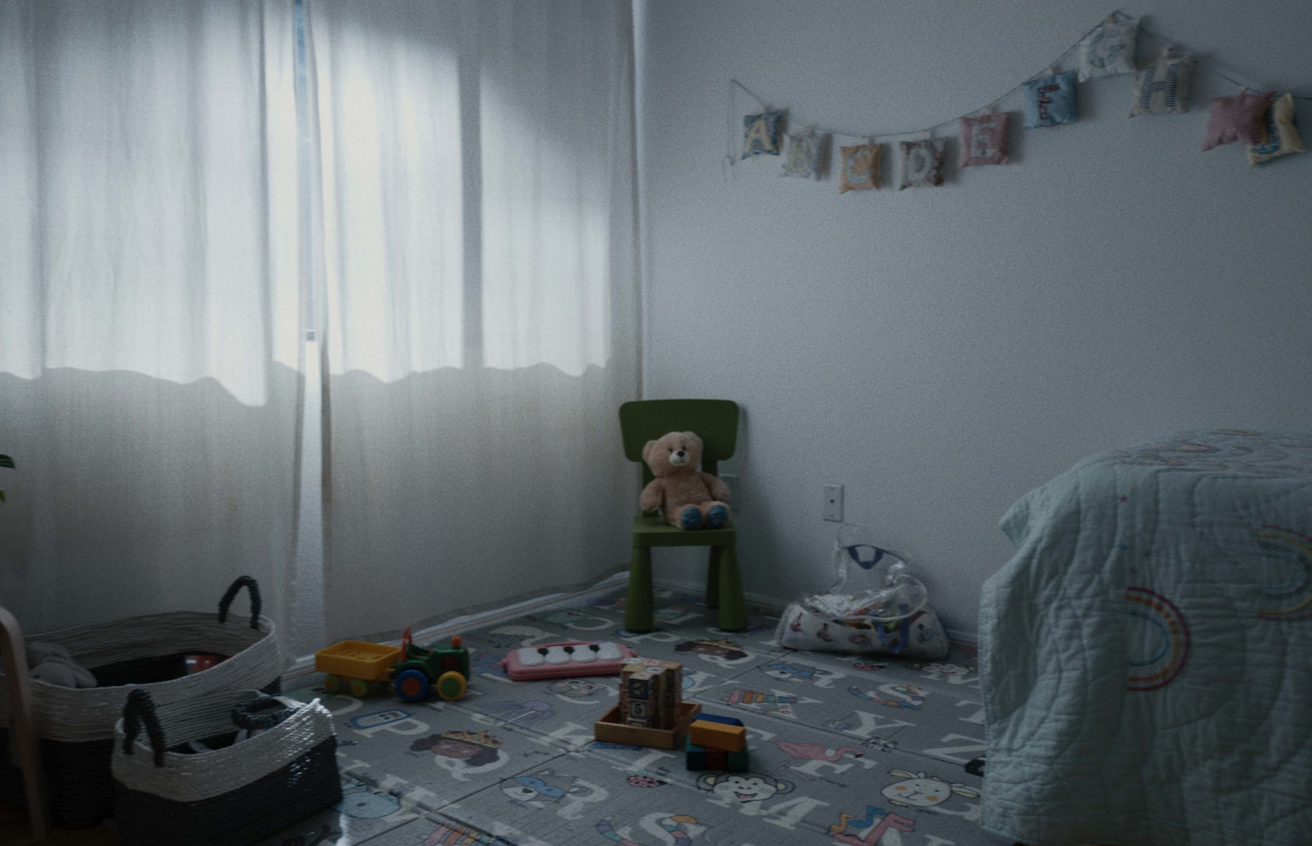
We even managed to feel our way into new visual elements that weren’t part of the original script. One of those was the set of surreal shots in the child’s bedroom. We were playing with the use of dream-like images of the hopes Dixon and Sarah shared to contrast their ideals with reality. It suddenly felt very necessary to see the little girl’s bedroom. So I asked my amazing production designer Nanichi Oliva to go ahead and fully dress the room. That scene was the last thing we shot that day, and we weren’t sure how we would shoot it until about fifteen minutes before we hit record. This is definitely not how I usually operate as a director or writer, but it was a really valuable learning experience!
Did you face any creative challenges during the development of the film? If so, how did you overcome them?
The voiceover was probably the biggest challenge. I knew I wanted some sort of narration to help string the scenes together in a cohesive way, but I also didn’t want it to read like a typical VO.
As I often do, I began this writing process by jotting down what I imagined to be a stream-of-consciousness or inner dialogue from my main character, Dixon. That ended up feeling like a pretty good VO solution to string the scenes together, so we included it in the script. Then, we adapted it to be attached to the story in a more practical way via a handwritten note. That led to the inspiration to make it a letter to his wife read by her. Finally, I re-wrote the whole thing to be more of a poem. Lots and lots of reassessing and tweaking, but it worked out well in the end!
The sound design and scoring process was another area that needed extra consideration. I wanted the audio to feel dreamlike, blurring between scenes with diegetic sounds coming and going. So I invited my amazing composer, Kyle McCuiston, and sound designer, Beau Manning, to work closely together to create something unique. Often, you finish the score and then send it to sound design for mixing. For this project, however, we sent countless revisions back and forth between departments so they could support one another in the most collaborative way possible.
How did you use color to deepen and reinforce the emotion of the story, and what did it take to make that vision come to life on set?
This is actually the first time I’ve intentionally played with using colors as a tool to amplify emotions over the course of an entire project. In the past, I’ve always approached color with a strong focus on realism, so finding the balance was tricky. That said, I was excited to take on the challenge and create something truly unique.
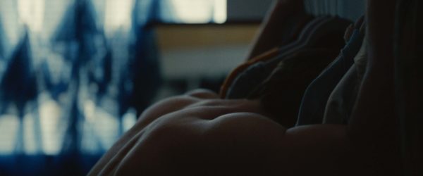
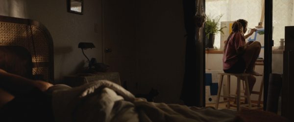
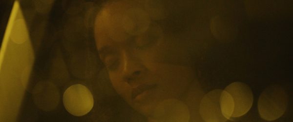
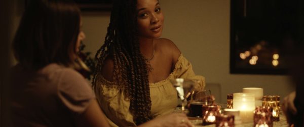
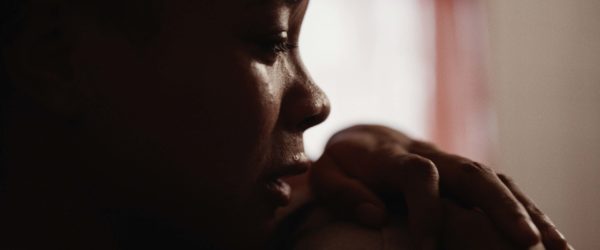
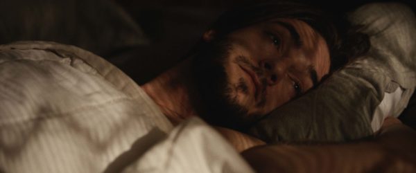
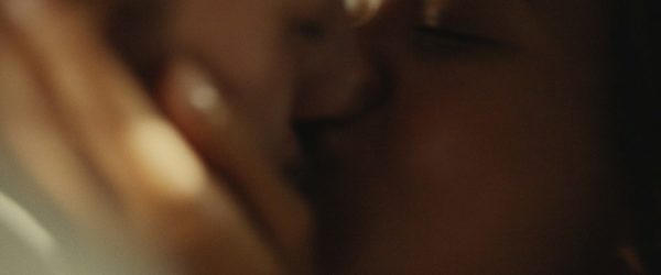
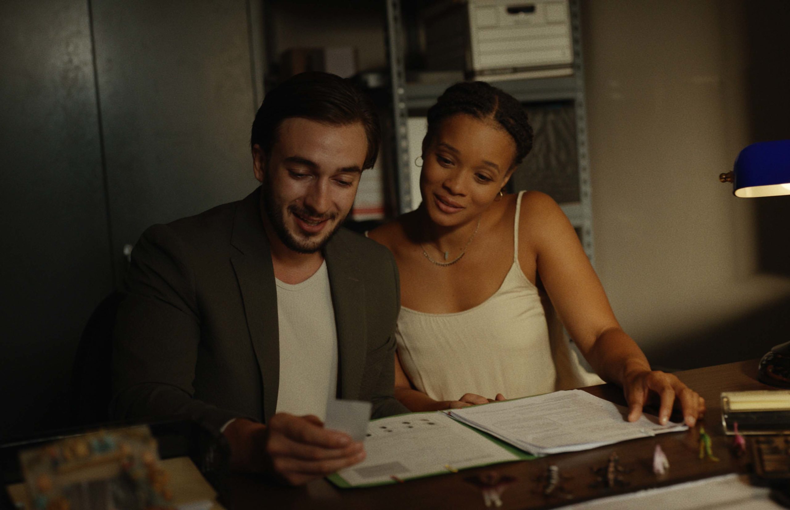
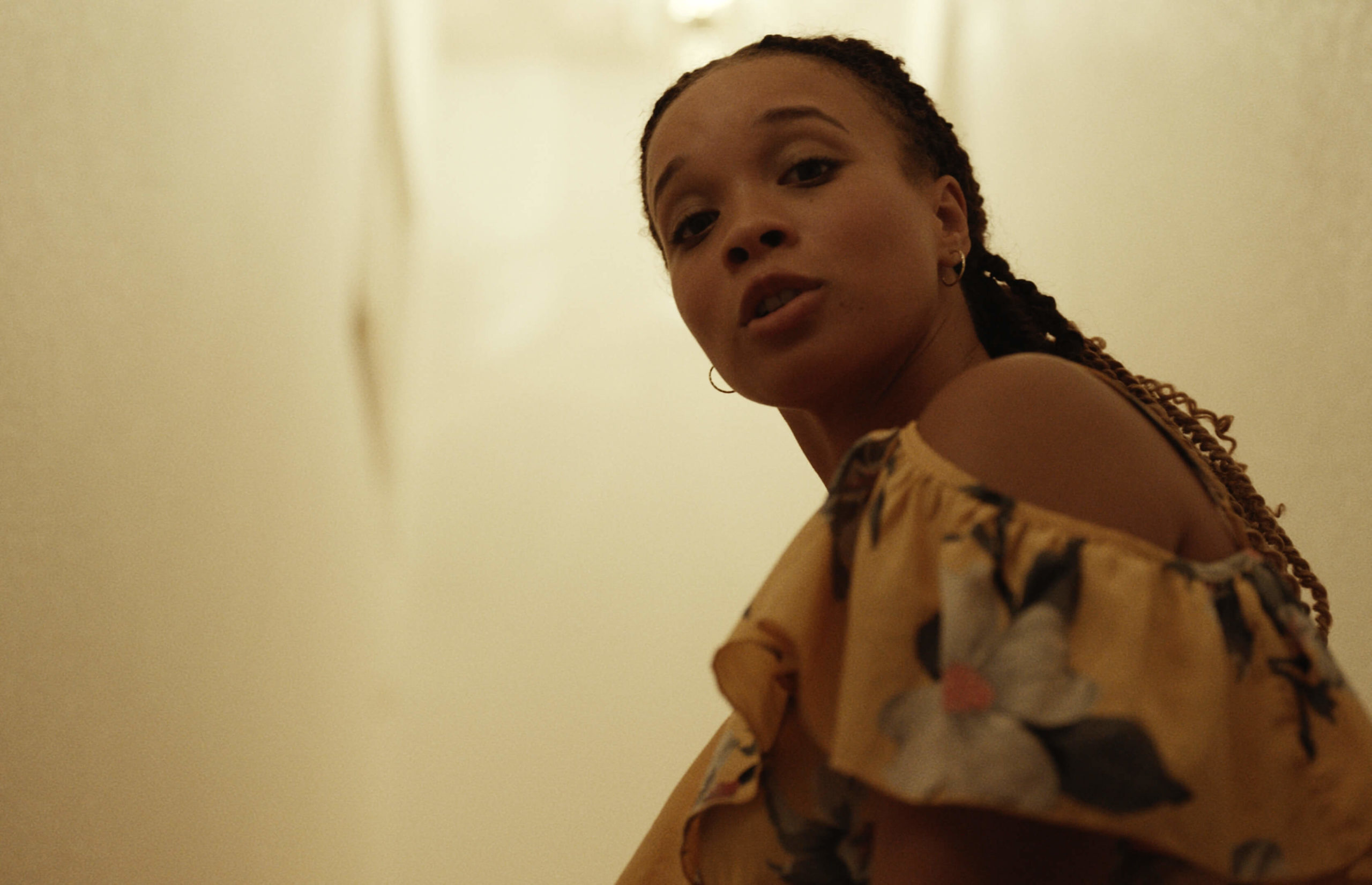
Tonally, we really wanted to connect strong colors with strong emotions and then interweave them as they morphed over the course of the story. We wanted pre-crash scenes to feel warm and stable despite the challenges and chose a warm palate to support that tone. Post-crash, the reality needed to feel cool and grief-laden, so blue was the natural choice. To heighten the impact, we edited the film to jump back and forth between those two realities quickly and repeatedly.
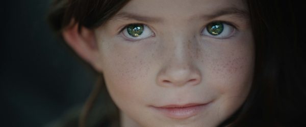
At the end of the film, our main character chooses to move into a new and hopeful season. To us, this was a clear opportunity to not only reinforce the emotions of the film but also the message of the story. Just as yellow and blue mix to make green, sometimes the greatest potential for our future is written by both the good and bad experiences in our lives coming together in a powerful way – if we’re willing to walk through them wholly. To that end, we chose green for our final color and aimed for the last scene to feel naturalistic and marked by lush green trees and other subtle green elements.
I knew I didn’t want to use over-stylistic lighting. So instead we shot certain scenes around specific times of day and utilized motivated lighting sources like the sun through orange curtains, warm practicals, and manipulated moonlight to affect the color in each scene.
Did you encounter any surprises in the editing process that required a creative solution?
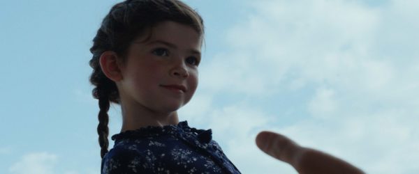
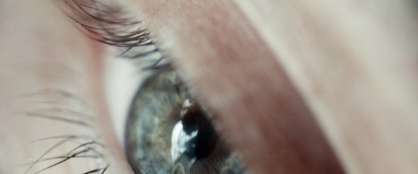
For a while, the final scene was falling flat. We had originally named the young girl “Hope” and planned to reveal this in the final moments of the film via an extreme close-up of her name in the green case file. To do this in a unique way, I custom-designed a five-foot piece of paper that had a collage of text on it that the camera would dolly across before landing on the word “HOPE.” It was a massively complicated setup, and we did a hundred takes.
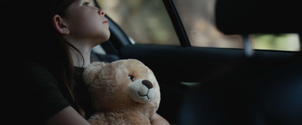
However, in the edit it just felt forced and gimmicky. After a lot of conversation, the solution to the issue was actually less about being creative and more about simplification. We still utilized the close-ups of the passing words, but we removed the shot of the word “HOPE” and refocused on the little girl in the backseat, shifting the emotional emphasis back to where it belonged. We spent a whole lot of energy and resources just to realize it’s better to show and not tell. Of course…
What do you hope to accomplish with this film?
I hope that this film can comfort those who have experienced loss, create empathy from those around them, and maybe even inspire some to choose adoption. I believe when we embrace the change that comes through discomfort or pain, we gain access to a new kind of life and beauty.

