What’s the point of being a filmmaker if you don’t try something ridiculously challenging every once in a while? For cinematographer Kate Arizmendi, once in a while happened earlier this year when director Phillip Lopez asked her to shoot an ad for Tyler Ellis’ handbag line that would appear on Vogue.com. The ad was set in a moveable room⎯ a space where the walls move independently of the floor. If you’re having trouble picturing that, you’re not alone. Even Kate wasn’t quite sure how the effect would play out. For that reason, and many more, it was the most technically challenging shoot Kate has ever tackled.
Read how Kate pulled off the lighting and cinematography below.
ORIGINS
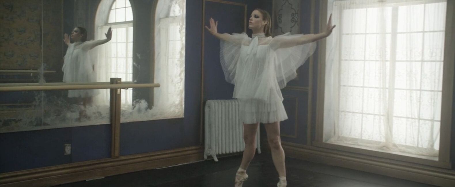
Back in January of 2016, director Phillip Lopez reached out to me about the biggest project we’ve ever done together: a film for Tyler Alexandra, a luxury brand of handbags, featuring a ballerina named Keenan Kampa. She’s an incredible dancer, and the idea was to put her in a room where the walls move independently from the floor. The concept was inspired by a music video directed by Jonathan Glazer for the 1990s British funk/acid jazz band Jamiroquai. In Virtual Insanity, the room moves but the floor doesn’t. It looks like the person is standing in one place even though he’s moving all around ⎯ or moving all around even though he’s standing in one place. We took that idea and added new elements to it, like a moving camera and the ability for the room to spin 360 degrees.
THE CHALLENGES
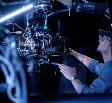
I knew this was going to be one of the most technical lighting/rigging projects I’d ever done. So I brought on Kiva Knight, an amazing gaffer who gaffed Moonlight and Kicks, and Tyler Johnson-Williams, a truly awesome key grip. We all sat down and tried to figure out whether we’d have lights attached to the movable room, or lights rigged above the 1,000 foot stage. It was a lot of ground to cover, so we ultimately decided it was best to rig everything to the movable room. We figured we’d build trusses over the top of the room so we’d constantly have a fill light (6 LiteMat 4s rigged overhead). Then Kiva suggested using these Quasar lights, which look like Kinos but are dimmable and can also switch between tungsten and daylight. Plus, they’re battery powered, which was a huge plus. So we got 96 of those, split them up between the windows, and used this thick, diffused glass for the windows so you wouldn’t be able to see the individual lights.
All the LED lighting was then wired to something called a RatPac Lunchbox that gave us wireless control over everything. That’s a huge upside to using mostly LEDs. It lets you create all of these different looks, and you can change it remotely just by touching a screen. If we’d had to change out lights and rig up gels, this whole thing would have been impossible.
6 DIFFERENT LOOKS
Ultimately, the film was going to include six costume changes, so I wanted to create six different lighting looks. We started out with the gradient going up on the windows with the Quasars and a dimmed top light. One of the ballerina’s outfits was white and she wore white makeup, so we turned up all the lights for a high-contrast, bright look. Then we did this black swan, very dramatic look where we dimmed the window lights and had a follow spot. Next, we did the 3 PAR Cans on each corner of these constant backlights. And finally we did the 18k sweeping light.
Obviously, there was a lot of rigging involved for all of these different looks, which ended up being the craziest part of all. Every cable had to be completely mobile. To make this work, we rigged up this insane pulley system that my electrics and grips designed, which gave the cables enough slack to move around the room, but, at the same time, automatically pulled them back up into one braid so nothing was dragging on the floor. It was…very complicated.
Here’s a breakdown of each look:
Look 1
All 96 Quasar tubes on each window dimmed down. No LiteMat top lights on. I wanted to start out somewhat dramatic and more natural looking, so the ballerina was lit only from the windows.
Look 2
The wall with two windows has the bottom half of the Quasar tubes on each window to create gradient. The wall with one window has all the Quasar tubes on full. All LiteMat top lights are on low. In this look we establish that the environment isn’t natural at all. So I created a gradient in the windows to emphasize this. I still wanted to keep the mood from the previous look, so I dialed in the top fill only a little.
Look 3
All 96 Quasar tubes are on in each window. All LiteMat top lights are on max intensity. This was the most high-key look we had. I liked the idea of maxing out all the lights (windows and top) with the white outfit for a brighter, more intense look.
Look 4
Both walls with windows have the bottom half of the Quasar tubes on in each window to create gradient. All LiteMat top lights are on max intensity. This look was similar to the one in Look 2, but I had all the top lights on maximum intensity to highlight the red dress and the falling rose petals.
Look 5
Spotlight above the set. The wall with one window has the bottom half of the Quasar tubes on in the window to create gradient. The wall with two windows has all the Quasar tubes on low. This is the “finale scene” where the ballerina transforms, much like in the film Black Swan. We used a theater spotlight above the set that followed her, as well as 3 PAR Cans on each corner of the set (on the opposite walls as the spotlight) to edge her as the steadicam moved around her.
Look 6
All Quasars on the windows were removed and the LiteMat top lights turned off. This was a closing look for the film with a dramatic sweeping 20k moving across the wall, with two windows ending in darkness.
PRODUCTION
As if thinking through this thing wasn’t hard enough, there were tons of challenges we had to embrace when it came time to actually shoot. One unexpected challenge was the dancer needed this thick pad to dance on because she’s up on her toes. The problem was the wheels of the movable room wouldn’t roll on that pad, so we basically had to cut out specific pieces for her to dance on and then choreograph around them. Later, we had the floor VFXed so it all looked like one thing.
Another unexpected problem was once we got all of our lights rigged onto this movable room, it weighed another thousand pounds, which meant it wasn’t nearly as quick and movable as Phillip had expected. When you’re trying to keep up with a professional dancer, the room has to be extremely fast. Luckily, he is very good at thinking on his toes, and we were able to come up with some cool camera movements to make up for the slow-moving room.Most of the camera movements ended up being improvised on the set because we weren’t sure what the effect would be like until we saw it for ourselves. From the moment I got that first email from Phillip about doing this project until the moment we were shooting, the whole thing was pretty mind-boggling. In the Jamiroquai video, the camera is locked off. So I knew a moving camera would create a completely different look, but I didn’t know if that would heighten the effect of the moving room or cancel it out. It ended up working out really well, as it created this very trippy effect that even surprised us as we watched the whole thing come together.For more on cinematography and the seemingly impossible, check out these posts:
