Color is a form of communication. It provokes emotion, tells you about a setting, and can even create confusion. In a way, this makes the role of a colorist a translator between the filmmakers and their audience — to make sure no message is lost. No one takes this responsibility more seriously than veteran colorist Jet Omoshebi. The lengthy list of credentials on her IMDB page, from commercials to film and TV, is proof of her trusted vision as an artist — and also why we asked her to be a judge for the 2017 Filmsupply Challenge.
In the past, our Framework series has solely featured DPs, but this time we asked Jet to break down some of her favorite frames to unveil not only her coloring process but how she translated the DP’s vision into a compelling image.
Here are 3 of her favorite frames and the stories behind them.
IN PLAIN SIGHT
Being a colorist is a rare privilege. It’s the first stage of post-production, and my suite is often the first place where months of shooting and story crafting finally start to resemble a finished product. It’s also the place where a director of photography usually sees their work cut together for the first time, which is an important moment that I never take lightly.
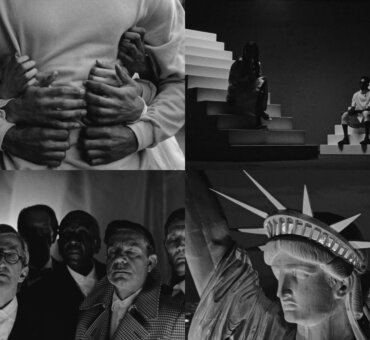
DP Ruairí O’Brien ISC and I have worked together several times, and he came to me in 2016 for a three-part drama called In Plain Sight (produced by World Productions for BBC Scotland, and directed by John Strickland).
Creative problem-solving has always been a big part of my job; but with this project in particular, it took the lion’s share. Ruairí had a strict set of limitations — not enough budget, not enough time, tough locations, huge ambition — and he decided not to use any filtering whatsoever and to opt for super sharp Master Primes as opposed to older lenses. None of these things were going to help me create a retro 1950s look, but challenges such as this can usually be minimized by talking to a colorist before shooting. In this case I asked Ruairí to shoot a basic camera test and bring me some reference pictures, so we could spend a few hours brainstorming ideas.
When grading a period piece, I always keep in mind not to introduce anything that wouldn’t have been typical at the time. So I’m careful about any colors that look digital or the occurrence of blown-out highlights. In the end, I decided to restrict the color palette, push an overall warmth for the interiors, and sneak in some areas of softness and defocus to take the edge off the sharp lenses.
It turned into a dream job primarily because of the input I was able to contribute at the very beginning.
HOOTEN & THE LADY
Every job I take on requires a unique approach. Sometimes it’s a corrective project and I’m just smoothing out footage from different cameras and adding some sunshine where there was none. Sometimes I’m designing an entire color palette to give something a completely distinctive look. But no matter what I’m doing, my main function is to have the DP’s back.
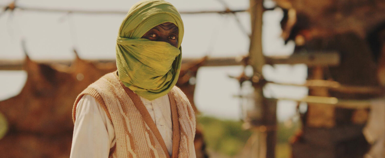
I worked on a 6-part adventure series called i (produced by Red Planet Pictures for Sky Vision). Every episode was written to be set in a different country; and I was asked to create a completely different look for each episode, which was a lot of fun. Episode 5 was shot by Giulio Biccari, a South African DP whom I’ve had the pleasure of working with many times over the years. We clicked immediately on our first day of working together, and we quickly worked out that our tastes are very similar.
The language used in a color grading setting is unique and almost entirely emotional. Things need to look honest, moody, joyful, gritty. It’s very different from everyday language, so it can be hard to key into exactly what’s being asked of you. But the shorthand Giulio and I developed works in our favor, because he’s often off shooting in a different place before the production is finished, and I’m left working alone. We’ve learned to communicate by emailing stills. He knows that even if he’s not present, I’ll represent his views during the grading process and fight for his ideas.
This episode, which was shot in the same location in Cape Town as the episode that preceded it, needed to look as though it were filmed somewhere completely different. Although there was plenty of blue in the skies, I decided to take it out to suggest a more glaring heat. I also added a bleach layer in the midtones to push the idea of brightness and heat.
OBSESSION
Although I started my career grading music videos and commercials, I do very few of either these days. So I was delighted when Dusthouse, a British production company, asked me to grade Obsession, a 30-second cinematic commercial shot by Ruairí O’Brien (produced for the Royal Shakespeare Company and directed by Chris McGill).
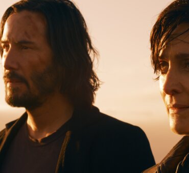
Ruairí shot on the ALEXA Mini, this time with anamorphic lenses on a black stage. The idea had to be quick and easy to manage, as he had Jude Law for only one hour. They shot inside a car, brought in all the light from outside, and used water spray and a torch to create flares and texture. By the time I received the shots, the only brief I got was, “Make it colorful.”
Green and gold is my absolute favorite color combination. It makes skin appear rich and glossy. And green has a slight perversion or dirtiness to it, which I would say, along with strong contrast, characterizes most of my grading.
Recently, an aspiring colorist asked me what I would tell my younger self back when I was starting out. It took me a few days to think of my answer. When I was just starting, I didn’t know what I didn’t know. I had no concept of doing the wrong thing; I just made the picture look interesting. As I became more experienced and the stakes got higher, I got a bit less daring, and my fingerprint slowly disappeared from my work. That’s something I’ve always wanted to reclaim. So, I actually think my younger self could tell me a thing or two.
